Context
In sensitive niches, Google Ads and Meta Ads can be limited or rejected. The website must earn traffic through SEO architecture, editorial content, regional pages and trust signals.
SEO project for a sensitive niche: adult mainstream dating, Turkey and Europe.
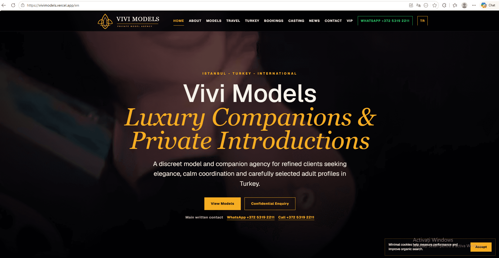
ViviModels.com is a live project for an international model agency. The client requested an SEO-first strategy, not ads, because the adult mainstream dating niche is sensitive and restricted on many advertising platforms. We built the site with clear architecture, organic-intent pages, controlled content and positioning for Turkey and Europe.
Status
Live
Niche
Adult mainstream
Channel
Organic SEO
Markets
Turkey + Europe
In sensitive niches, Google Ads and Meta Ads can be limited or rejected. The website must earn traffic through SEO architecture, editorial content, regional pages and trust signals.
We created a premium presence with simple navigation, language versions, pages for models, travel, Turkey, bookings, casting and news. The structure supports organic indexing and keeps confidential requests separate.
The project is prepared for organic growth through long-tail content, local pages, informational articles and technical optimization. The focus is international search from Turkey and Europe, not paid traffic.
International website for a model agency
SEO architecture for a sensitive niche
EN/TR multilingual structure
Pages for models, bookings, casting, travel and news
Premium design with discreet editorial tone
Organic strategy without Google Ads or Meta Ads dependency
We can build websites where SEO, structure and trust matter more than ads: dating, premium services, private marketplaces or international projects.
Request SEO strategy on WhatsAppExtended case study
International website, multilingual and SEO for a sensitive niche. We examine the decisions that transformed the initial requirement into a usable product for international users looking for companion services and private introductions.
Open Vivi Models01 · Executive summary
Vivi Models is an international project where design, content and SEO must maintain a balance between visibility, discretion and clarity. The website presents services and destinations without turning the experience into an aggressive catalog. The architecture emphasizes organic search, topic pages, security and controlled contact.
The project primarily serves international users looking for companion services and private introductions, within the market context of Turkey and selected international destinations. The evaluation therefore goes beyond the visual appearance of the first page. A strong digital product must explain the offer, guide the user toward an appropriate action, keep information accessible on mobile devices, and remain manageable after launch. These criteria shaped the architecture, content, and implementation order.
The primary objective was to build a discreet, fast and indexable presence for a niche with high privacy requirements. To achieve it, we treated the website as part of a system: public pages establish context, forms and actions capture intent, and the tools behind them organize follow-up. Every section therefore has a verifiable purpose. It does not merely fill space; it answers a real user question or removes an unnecessary step from the process.
02 · Context and strategy
Sensitive niches face advertising restrictions, moderation requirements and risks of duplicate content. The project could not depend solely on advertisements. It needed an SEO base, a premium identity and strict rules for images, data and forms.
The first step was to separate mandatory requirements from ideas that could be added later. We mapped the audience, important actions, content types, languages, data requirements, and administration model. This analysis prevented the creation of an attractive page that would be difficult to extend. It also clarified what should remain public for indexing, what belongs in a private flow, and what information should be stored in the CRM or administration panel.
We prioritized indexable content and structure on services and destinations. Language is controlled and contact occurs by context. Security and privacy measures are built into the experience, not added as isolated notes.
The strategy followed a simple order: users first understand where they are, then what they receive, why the solution is relevant, and what to do next. Trust elements were placed close to the decision instead of being hidden on a secondary page. Detailed information received its own level in the hierarchy, keeping the first screen focused while remaining available to people who compare offers carefully.
Pages group positioning, services, destinations, information and contact. Each page should have a clear intent and avoid cannibalizing other destinations. Navigation provides access to essential information without unnecessary exposure of sensitive details.
Information architecture has been validated through trails, not just through a list of pages. I've been watching what happens if the visitor goes straight from Google to an inside page, comes back from his cell phone, or ends up in an ad with a precise intention. Each route maintains access to context, offer and contact without forcing the user to manually return to the main page.
03 · Implementation
Implementation was divided into modules with clear responsibilities. This approach reduces dependencies between pages, allows targeted updates, and helps the team test important functions without blocking the entire product. Visual components follow shared rules, while content and user journeys are adapted to the project instead of being copied mechanically from a template.
Services and destinations have separate contexts for searching and browsing.
Visual hierarchy supports trust without aggressive commercial elements.
The contact only requests the information necessary for the current step.
Content and images are reviewed before publication.
At the technical level, we paid attention to intermediate states: loading, error, confirmation, empty results, and returning to an unfinished flow. These situations are common in real use even though they rarely appear in static mockups. Messages and controls were designed so users understand what happened and can continue without immediate support.
Content was treated as part of the product. Headings explain the decision at hand, paragraphs use concrete examples, and buttons clearly name the action. We avoided generic wording that promises a great deal without explaining the deliverable. In a case study, this clarity is as important as the technology because it shows what was implemented and why the solution fits the project's audience.
04 · Experience and Conversion
The visitor arrives through a search or referral, checks the positioning and conditions, then uses a contact channel. The conversion is intentionally unobtrusive. Forms do not ask for data that is not necessary before the context is established.
The conversion route was designed around intent, not a single button. Early people need explanations and examples, while determined visitors seek price, contact or direct action. The page keeps both variants, but sets a clear visual priority. Secondary actions do not compete with the main action and contact remains accessible without aggressive windows.
The forms only require the data required for the relevant stage. An initial application should not be converted into a long questionnaire and an order should not be left without the information the team needs to reply to. Confirmation explains the next step and estimated time. This continuity reduces repeated messages and sends that the process is administered, not improvised after sending the form.
Premium images and text must remain balanced on mobile. The layout preserves readability and the contact elements do not cover the content. Image optimization is important for both speed and discretion.
On mobile, the order of content has been revised separately. I didn't just shrink the desktop version. Titles, images, buttons, lists and spaces have been reorganized for one-handed reading. Interactive areas have stable dimensions, the text is not hidden in rigid containers, and long sections retain visible landmarks. For individuals using keyboard or assistive technology, labels, hierarchy of titles and focus states retain the meaning of actions.
05 · Discovery and data
The strategy is based on thematic pages, destinations, metadata and internal links. Canonicals and sitemap control variants, and content avoids artificial repetition. Indexing monitoring is essential in a niche where platforms can apply additional filters.
The search optimization starts with a structure that the user can understand. Each important page has a main subject, descriptive title, description and links to the pages that complement the intention. The images have stable dimensions and descriptive alternative texts, and the addresses of the pages are kept simple. Canonical, sitemap and rules for crawlers support the same architecture and avoid indexing technical states, filters or private pages.
Internal links are used editorially: they explain the relationship between the project and the services that made it possible. External links send to the public product and verified sources, allowing the reader to compare the description with the actual implementation. We don't use an artificial list of keywords. The context, correct names and verifiable information are more useful for both humans and search engines.
Organic traffic, landing pages, contacts and quality of inquiries are tracked. No more data than necessary is collected. Analysis must distinguish informational interest from an actual request.
Measurement is defined before reporting. Visits, scrolls and clicks are user indicators, but they are not automatically a business result. For each project, actions that have value are tracked: requests, calls, orders, access to a function or return. Events are consistently referred to so that data can be compared between pages and periods without different manual interpretations from one relation to another.
Content, images and landing pages require editorial review before publication. Security, updates and link monitoring are continuous. Any new integration is also evaluated from a privacy perspective.
The launch does not complete the project. It is necessary to check forms, update information, monitor errors, review dependencies and regularly control indexed pages. The roles and rights of access limit accidental changes and safety copies and history of changes reduce operational risk. A modular structure allows expansion without affecting routes that already operate.
These links provide additional technical context and describe the supplies used in implementation.
06 · Verifiable Gallery
The screenshots below document the project; they are not decorative images. Each one can be opened at a larger size to inspect the hierarchy, content, and interface details. The gallery is placed beside the technical explanation so readers can verify the connection between the decisions and the visible result.
07 · Conclusions
The most important conclusion is that a digital product should not be assessed as a collection of screens. Its value lies in the connection between the message, interaction, data, and the process that follows contact. For Vivi Models, this link was built from the specific needs of the segment international users looking for companion services and private introductionswithout forcing the project into a universal structure.
The second conclusion is that visible simplicity requires work in architecture. For a user to see few clear choices, the system must manage pages, states, roles, content and measurement correctly. This complexity must not be transferred to the interface. It is organised behind and progressively revealed only when it becomes relevant.
The analysis was confronted with available public pages. The links below are provided for direct verification and additional editorial context.
08 · Frequently Asked Questions
Because Vivi Models serves international users looking for companion services and private introductionsand this audience has its own path, language and confidence criteria. A template can speed up prototyping, but it cannot decide on its own what information to publish, what action is priority, how to keep the context between pages or how to measure the result. The final structure was built from the requirements of the project, then visually unified through reusable components.
The important flows have been reviewed at different sizes, carefully in the order of content, the size of the pressing areas, legibility, images and forms. The mobile is not a small copy of the desktop. Some elements change order, the lists are simplified and the main proceedings remain available without covering content or other checks.
It means that public pages have clear topics, titles and own descriptions, semantic hierarchy, descriptive images, internal links and stable addresses. The sitemap, canonicals and indexation rules support the same structure. SEO is not a promise of position, but the technical and editorial capacity of the site to be discovered, understood and evaluated correctly by search engines.
The modules are separated so that Vivi Models be able to receive new pages, functions, integrations and content without complete reconstruction. Expansion starts with user data and actual customer questions. New functions are prioritised by impact, dependency and cost of administration, not just by the fact that they can be technically added.
The availability of pages, errors, forms, relevant actions, speed and navigation behaviour shall be monitored. The data shall be interpreted in relation to the objective of the project. If a page attracts traffic, but does not lead to useful action, the message, information order and supply shall be reviewed before increasing the promotion budget.