Context
Local companies need a simple way to collect feedback, real testing and micro-actions without heavy platforms. Users need clarity: what to do, how long it takes, what they receive and how they send proof.
A Moldova-focused product that turns simple tasks into clear rewards.
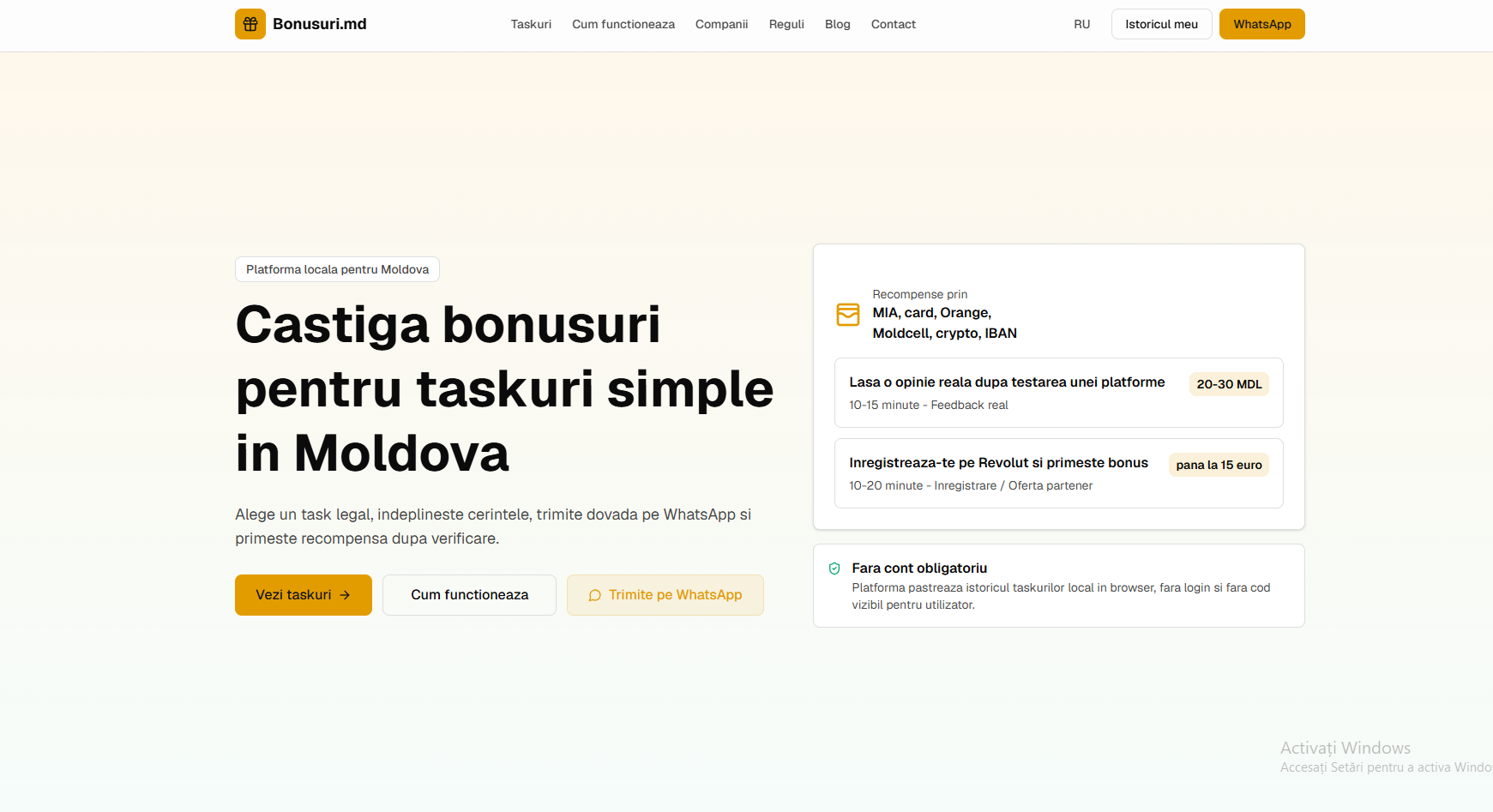
Bonusuri.md is a live product în development where users choose simple tasks, send proof through WhatsApp and receive a reward after verification. The concept is adapted for the local market: MIA, card, Orange, Moldcell, crypto or IBAN payments, local history without mandatory account and a very fast mobile experience.
Status
Live
Market
Moldova
Rewards
20-30 MDL
Flow
Local companies need a simple way to collect feedback, real testing and micro-actions without heavy platforms. Users need clarity: what to do, how long it takes, what they receive and how they send proof.
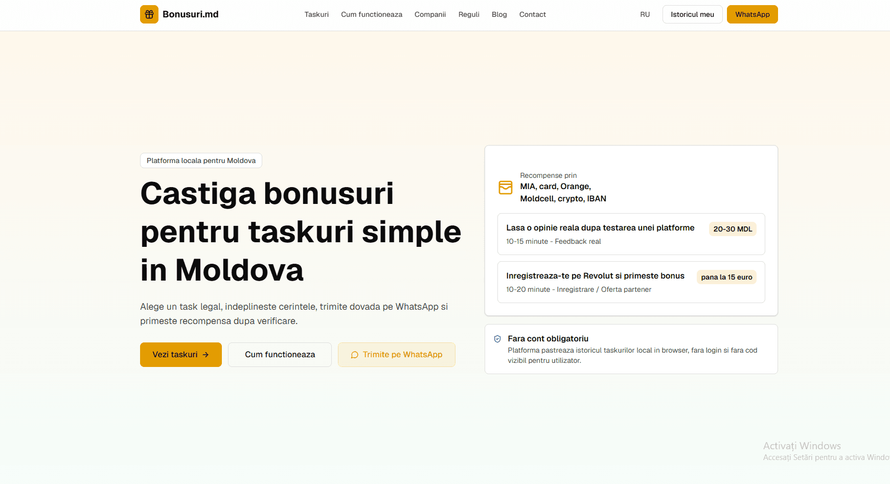
We built a clean concept with tasks shown as concrete offers, direct WhatsApp CTA, locally saved history and trust-focused messaging. The white and yellow design quickly communicates bonuses, rewards and action.
Bonusuri.md is positioned as a local task and rewards platform for Moldova. The structure can grow into company pages, rules, blog, sponsored tasks and measurable campaigns for clients.
For indexing, the project needs clean pages for active tasks, rules, partner companies and educational articles about online bonuses, paid tasks, real feedback and rewards în Moldova. ADS Moldova can connect the product with ads, analytics, tracking and automations.
Clear homepage with conversion-oriented headline
Task cards with duration, requirement and reward
WhatsApp flow for proof submission and validation
Local history without mandatory account
SEO structure for tasks, companies, rules and blog
Responsive, fast and scalable design
We can build a task platform, marketplace, lead system or local digital product with integrated SEO, conversion and automation.
Extended case study
Platform of tasks, proofs and rewards. We examine the decisions that transformed the initial requirement into a usable product for companies validating actions and users performing tasks.
Open Bonusuri.md01 · Executive summary
Bonusuri.md is an operational platform, not a simple catalog of promotions. It links three roles: the company that publishes a task, the user that executes it, and the administrator that verifies the proof. The project was built for clarity, traceability and quick use, including through WhatsApp, without turning every action into a heavy onboarding process.
The project primarily serves companies validating actions and users performing tasks, within the market context of Republic of Moldova. The evaluation therefore goes beyond the visual appearance of the first page. A strong digital product must explain the offer, guide the user toward an appropriate action, keep information accessible on mobile devices, and remain manageable after launch. These criteria shaped the architecture, content, and implementation order.
The primary objective was to provide a transparent flow for local tasks, proof verification and awarding of rewards. To achieve it, we treated the website as part of a system: public pages establish context, forms and actions capture intent, and the tools behind them organize follow-up. Every section therefore has a verifiable purpose. It does not merely fill space; it answers a real user question or removes an unnecessary step from the process.
02 · Context and strategy
The idea required more than a splash page. It needed separate accounts, statuses, uploaded proofs, rules, rewards, referrals and boards. At the same time, the experience had to remain simple enough for people entering from the phone who want to immediately understand what they are doing and what they are getting.
The first step was to separate mandatory requirements from ideas that could be added later. We mapped the audience, important actions, content types, languages, data requirements, and administration model. This analysis prevented the creation of an attractive page that would be difficult to extend. It also clarified what should remain public for indexing, what belongs in a private flow, and what information should be stored in the CRM or administration panel.
We modeled the product around the full cycle of a task: publish, accept, execute, prove, verify, and reward. Each stage has an explicit state. This choice reduces ambiguous discussions and gives the administrator a verifiable history and shows the company what work has been done.
The strategy followed a simple order: users first understand where they are, then what they receive, why the solution is relevant, and what to do next. Trust elements were placed close to the decision instead of being hidden on a secondary page. Detailed information received its own level in the hierarchy, keeping the first screen focused while remaining available to people who compare offers carefully.
The public pages explain the mechanism and types of tasks, and the authenticated areas are separated by role. The user sees their tasks and proofs, the client sees campaigns and results, and the administrator manages validation, payments and content. The blog and legal pages add to the credibility of the product.
Information architecture has been validated through trails, not just through a list of pages. I've been watching what happens if the visitor goes straight from Google to an inside page, comes back from his cell phone, or ends up in an ad with a precise intention. Each route maintains access to context, offer and contact without forcing the user to manually return to the main page.
03 · Implementation
Implementation was divided into modules with clear responsibilities. This approach reduces dependencies between pages, allows targeted updates, and helps the team test important functions without blocking the entire product. Visual components follow shared rules, while content and user journeys are adapted to the project instead of being copied mechanically from a template.
Each task goes through clear stages, from publication to reward validation.
Uploading and reviewing evidence reduces ambiguity between client and participant.
Each type of user sees only the necessary actions and information.
Tasks and proofs can be managed from a phone-optimized interface.
At the technical level, we paid attention to intermediate states: loading, error, confirmation, empty results, and returning to an unfinished flow. These situations are common in real use even though they rarely appear in static mockups. Messages and controls were designed so users understand what happened and can continue without immediate support.
Content was treated as part of the product. Headings explain the decision at hand, paragraphs use concrete examples, and buttons clearly name the action. We avoided generic wording that promises a great deal without explaining the deliverable. In a case study, this clarity is as important as the technology because it shows what was implemented and why the solution fits the project's audience.
04 · Experience and Conversion
For the user, conversion is choosing and completing a task. For a business, conversion is the publication of measurable activity. Messages and CTAs are differentiated for these two intents so that the product doesn't present the same offer to everyone.
The conversion route was designed around intent, not a single button. Early people need explanations and examples, while determined visitors seek price, contact or direct action. The page keeps both variants, but sets a clear visual priority. Secondary actions do not compete with the main action and contact remains accessible without aggressive windows.
The forms only require the data required for the relevant stage. An initial application should not be converted into a long questionnaire and an order should not be left without the information the team needs to reply to. Confirmation explains the next step and estimated time. This continuity reduces repeated messages and sends that the process is administered, not improvised after sending the form.
Important actions are designed for the phone: opening a task, reading the rules, uploading the proof and checking the status. Forms keep fields short, and panels use prioritization and visible states instead of dense tables on small screens.
On mobile, the order of content has been revised separately. I didn't just shrink the desktop version. Titles, images, buttons, lists and spaces have been reorganized for one-handed reading. Interactive areas have stable dimensions, the text is not hidden in rigid containers, and long sections retain visible landmarks. For individuals using keyboard or assistive technology, labels, hierarchy of titles and focus states retain the meaning of actions.
05 · Discovery and data
The public content describes the tasks, rewards, company benefits and verification mechanism. These pages make the product intelligible to search engines, while private areas remain out of indexing. Links to rules, privacy and blog support transparency.
The search optimization starts with a structure that the user can understand. Each important page has a main subject, descriptive title, description and links to the pages that complement the intention. The images have stable dimensions and descriptive alternative texts, and the addresses of the pages are kept simple. Canonical, sitemap and rules for crawlers support the same architecture and avoid indexing technical states, filters or private pages.
Internal links are used editorially: they explain the relationship between the project and the services that made it possible. External links send to the public product and verified sources, allowing the reader to compare the description with the actual implementation. We don't use an artificial list of keywords. The context, correct names and verifiable information are more useful for both humans and search engines.
Useful indicators are published tasks, participations, accepted proofs, verification time and completed rewards. Each state of the flow can be tracked separately, which makes it possible to identify points where users abandon or where the verification needs clarification.
Measurement is defined before reporting. Visits, scrolls and clicks are user indicators, but they are not automatically a business result. For each project, actions that have value are tracked: requests, calls, orders, access to a function or return. Events are consistently referred to so that data can be compared between pages and periods without different manual interpretations from one relation to another.
The role and state model allows adding new types of tasks without changing the core mechanism. Rules, evidence, and rewards can evolve incrementally, and the separation of the public interface from the operational panels keeps the product easy to manage.
The launch does not complete the project. It is necessary to check forms, update information, monitor errors, review dependencies and regularly control indexed pages. The roles and rights of access limit accidental changes and safety copies and history of changes reduce operational risk. A modular structure allows expansion without affecting routes that already operate.
These links provide additional technical context and describe the supplies used in implementation.
06 · Verifiable Gallery
The screenshots below document the project; they are not decorative images. Each one can be opened at a larger size to inspect the hierarchy, content, and interface details. The gallery is placed beside the technical explanation so readers can verify the connection between the decisions and the visible result.
07 · Conclusions
The most important conclusion is that a digital product should not be assessed as a collection of screens. Its value lies in the connection between the message, interaction, data, and the process that follows contact. For Bonusuri.md, this link was built from the specific needs of the segment companies validating actions and users performing taskswithout forcing the project into a universal structure.
The second conclusion is that visible simplicity requires work in architecture. For a user to see few clear choices, the system must manage pages, states, roles, content and measurement correctly. This complexity must not be transferred to the interface. It is organised behind and progressively revealed only when it becomes relevant.
The analysis was confronted with available public pages. The links below are provided for direct verification and additional editorial context.
08 · Frequently Asked Questions
Because Bonusuri.md serves companies validating actions and users performing tasksand this audience has its own path, language and confidence criteria. A template can speed up prototyping, but it cannot decide on its own what information to publish, what action is priority, how to keep the context between pages or how to measure the result. The final structure was built from the requirements of the project, then visually unified through reusable components.
The important flows have been reviewed at different sizes, carefully in the order of content, the size of the pressing areas, legibility, images and forms. The mobile is not a small copy of the desktop. Some elements change order, the lists are simplified and the main proceedings remain available without covering content or other checks.
It means that public pages have clear topics, titles and own descriptions, semantic hierarchy, descriptive images, internal links and stable addresses. The sitemap, canonicals and indexation rules support the same structure. SEO is not a promise of position, but the technical and editorial capacity of the site to be discovered, understood and evaluated correctly by search engines.
The modules are separated so that Bonusuri.md be able to receive new pages, functions, integrations and content without complete reconstruction. Expansion starts with user data and actual customer questions. New functions are prioritised by impact, dependency and cost of administration, not just by the fact that they can be technically added.
The availability of pages, errors, forms, relevant actions, speed and navigation behaviour shall be monitored. The data shall be interpreted in relation to the objective of the project. If a page attracts traffic, but does not lead to useful action, the message, information order and supply shall be reviewed before increasing the promotion budget.